Website design with Avidmode: learning about layouts
This is a new series that we’re bringing to the blog, all about web design. If you have a background in graphic design or art, these concepts will be very…
This is a new series that we’re bringing to the blog, all about web design. If you have a background in graphic design or art, these concepts will be very familiar to you. If not, hop in and learn more about what website design is, what it’s made up of and how we use it in our own website builds at Avidmode.
The rest of the series is listed here, you can click through the links (once the posts are live) below to navigate to the most appropriate for you!
1. Website Design with Avidmode: Learning About Layouts
2. Website Design with Avidmode: Concerning Colour Theory
3. Website Design with Avidmode: Thrilling Textures
4. Website Design with Avidmode: Typography and Text
5. Website Design with Avidmode: Inspiring Imagery
Layouts Start At The Beginning
Layouts are where the website design process really starts to pick up steam – once your web designer has all the details about your business and the goals behind your website, they should start off with a layout for your full website.
But what is the purpose of creating a layout, why are they important and we look back at three decades worth of web design.
Definition of Website Layouts
We often fall into the trap of using terms that non-designers/developers do not necessarily know off the top of their heads, so here is a quick definition of some of the terms related to website layouts that you might have seen across the internet. This should help as you head through this blog post!
Sitemaps – This looks like a simple document with the names of your pages on it. It’s not difficult to understand which is great! The main thing you need to know about the sitemap is that there are hard and fast rules for where things should be placed. Your home page will always be at the top, it’s the very first place people will go. The following pages will include, your services/products, about pages, resources and finally the contact. Essentially, it’s a hierarchy of the most important pages for your readers. For some websites, the sitemap will be quite straightforward, in others, it will look a bit more like a large family tree!
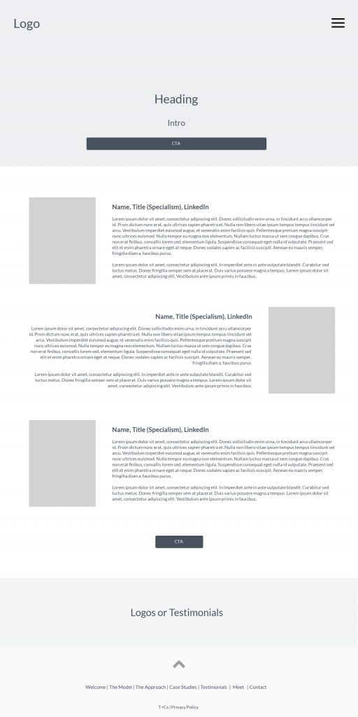
Wireframes – Theseare created by your designer. These will give you a first look at what you should expect to be placed where on the website. Each page has it’s own wireframe, it will detail blocks for content, headers, images and the like. The whole reason for wireframe creation is to map out where we want the eye to be drawn as your customers or clients move down the page. You can see examples of these down below.
Navigation – Navigation refers to the part of the website that you use to move around. On most websites these days, this is located at the top of the screen and will usually include a link to your home page, service, about and contact pages. A website’s navigation should reflect the sitemap and wireframes that your designer has created.
Responsive Layout – When we talk about Responsive Layouts, we are usually talking about the ability of the layout to be used in different formats. Building websites used to be something that you only did with desktop monitors in mind (and at one point even they were similar sizes) but these days we must consider how people use the internet. A huge amount of internet goers are now using mobile devices including tablets to reach different websites and apps. All websites designs and layouts must be able to work with different screen resolutions, capabilities, browsers etc.
UX – UX stands for User Experience. As a customer, visitor, or reader of a website, you are also considered a user. There are customer experience employees at a theme park or a shopping centre and so there are User Experience experts who make sure that websites are built to offer the best experiences users. UX experts will consider how a user might use the website and make additions that help the flow of the users journey work seamlessly.
What is a Website Layout?
Website layouts are essentially the floor plans to your website. With a small website you would only be expecting to see a couple of pages worth of layouts, for a larger website this could be 30+ pages. Most websites are built to give their businesses or owners some more visibility, layouts assist the designer in understanding the journey that those prospective visitors will take through the website. In fewer words, website layouts are the starting point for a website with great usability and user experience.
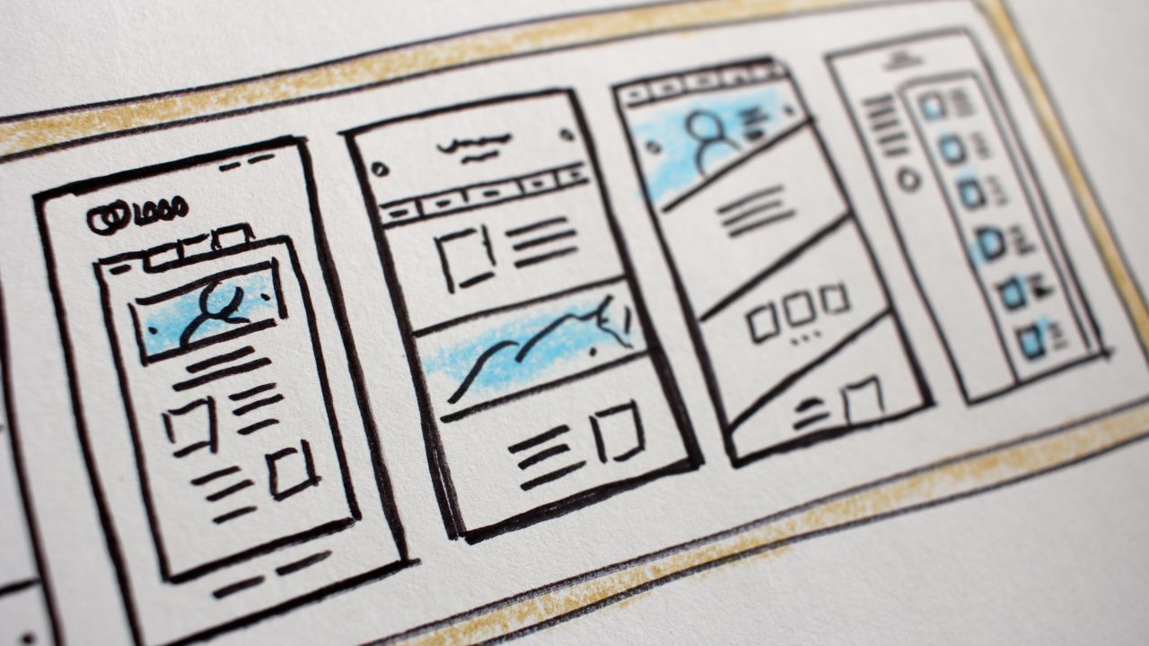
Below you can see an example of a basic wireframe that we have created in the past. At Avidmode, we create hand drawn versions before digitising them for our clients.
Website Layouts Over 30 Years
Over the last 30 years we have come so far in terms of website design and things are still moving at pace.
We recently sat down as a team and discussed some of big business websites and how their layouts have informed general website best practices or worst practices!
We’ve put together a carousel of screenshots from familiar websites across the last three decades. Some have changed names; some aren’t really popular anymore (RIP Myspace) but it’s interesting to take a look at how the best practices for website design began.
WWW
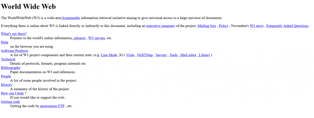
http://info.cern.ch/hypertext/WWW/TheProject.html
The first website on the internet. If you ever did any HTML lessons at school you’ll be familiar with the way this looks. The page has no real colour, no graphic design elements and no framework or structure. In fact, the web at this point was mostly used as a complicated extension of a home encyclopaedia. This simple page was the catalyst for the internet as we know it today!
Amazon (2000)
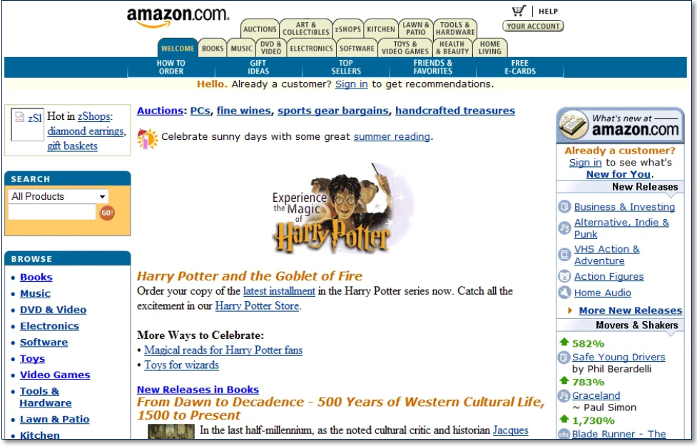
https://www.versionmuseum.com/history-of/amazon-website
Some standout points – the useless welcome tab that has now been replaced by the logo home page link. Sidebar galore, both a left and right-side column with content overload. Search function included in the left side of the website that’s now considered old hat, most search functions will now be found in the middle of the website home page or along the top of the navigation.
Google (1999)
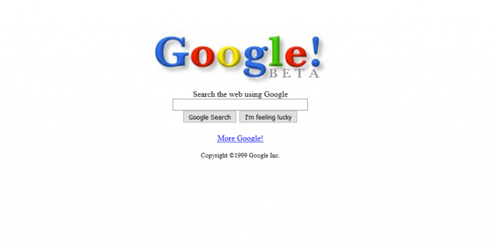
https://www.webdesignmuseum.org/timeline/google-1999
Let’s go back 22 years to the beta version of Google. If you look at the 1999 page and the 2021 version side by side, they look very similar and that is for two reasons, first of all – it works, so why change it. The search bar on the white background signifies to a user that there is only one reason that they are using this page and that’s to find an answer. The current version is slightly adapted to include links to Google products that didn’t exist back in 1999 such as Gmail and Google Drive. Second, this home page is the branding of Google, it’s familiar and is part of the reason that we now use Google as a verb.
Netflix (2003)

https://www.webdesignmuseum.org/gallery/netflix-2003
We are in the new millennium. Now home and king/queen of the binge-worthy shows – Netflix used to be a film service that would send out the movie to you in CD form for you to watch and then send back. This is one of the businesses on the list that has pivoted their business model the most and their website has adapted to reflect that. Netflix is one of the simplest websites to navigate with a limited navigation bar at the top of the page and thumbnails for their content choices. You’ll notice that YouTube and Netflix follow a similar layout.
Myspace (2006)
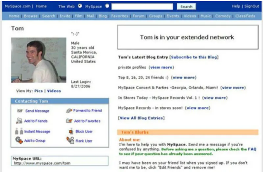
https://nextshark.com/myspace-tom-asia-instagram/
Now considered one of the lesser social media platforms, Myspace played a huge part in inspiring current social platform usability today. Most social platforms make use of the block format, you can see this on Facebook where they have the feed in the centre and then tons of links off to the side to allow you to move around the different pages. As Myspace expanded, so did it’s navigation bar – if you saw something like this today on a current website it would be considered busy.
YouTube (2007)
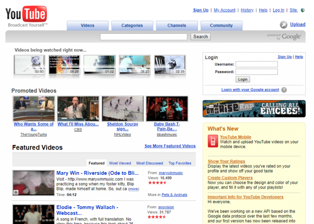
https://www.webdesignmuseum.org/timeline/youtube-2007
One of the most fascinating things about YouTube is it’s back-end algorithm and how that’s changed since they became connected to Google – but I digress. The layout of YouTube is still familiar to its 2007 screenshot. This example looks a lot like the Myspace layout with blocks for different types of content. These days they have taken to using the sidebar just like Facebook, this is totally down to user familiarity and the fact that they have so many links to other pages that putting it all into a navigation bar would make the pages way too top heavy – just like the old Amazon screenshot.
Iteration of design is something that is still happening today and website design will continue to evolve in the future. Some of the aspects that we’ve looked at here are still being used in websites built in 2021, others haven’t been seen since the millenium bug was on our minds.
Why is a Website Layout Important?
Websites are now one of the main ways that people experience brands, products, and communities. Preparing a website layout before creating full designs is a way to ensure that the designer considers website design best practices. A pretty website is all well and good but if it does not signpost people properly it won’t be as successful as something that is holistically built with all facets in mind.
In the last section we looked at some of the sweeping changes in website design over the last 30 years. You’ll notice that some of those principles from older websites still exist in some forms today – this is the crux of reason that getting your website layout is important.
Visitors to your website are trained by continuous use of the web to expect certain elements to be available on your website.
Some aspects that are ALWAYS expected on a website these days include:
- Static logo in the navigation bar that leads back to the home page.
- Drop down lists from the navigation to allow for self-selection of service or product categories.
- Search bars (prevalent on product or content heavy websites).
- Access links to social media profiles at the bottom of the pages.
- Log in or Access account buttons on the top bar of the navigation.
These are some simple examples of website layouts that we all instinctively know after using the internet and websites for many years. If your website isn’t following the website layout standards it creates a sub-par user experience that people will notice and likely become confused or frustrated by.
Website Layout and Navigation Standards
When it comes to designing your website layout there are some main guideline points that we always consider. These are the elements which make up your website and any user will be expecting to see these at they make their way onto your page. Remember, it takes about 10 seconds for a person to decide to search through more pages of your website or to head onto another search result or website. 10 seconds is a infantecimal amount of time in which to make a yes/no decision but we do it every day!
Site Architecture/Sitemap – This is a flow chart of all the pages on your website, it shows how your pages link to one another and it gives you a lot of insight into how confusing a website can really look to your viewers. Sometimes, when building the site architecture, we already have quite a lot to go off of, especially if the products or services the clients are trying to sell are well established. This is also where we bring in some keyoword research, each of the pages names should be researched and then adjusted to suit the search intent of people who will visit your website. Having this document done first helps to strengthen the ideas of what kind of journey a visitor will take on your website.
Search – Not all websites will have a search bar, this really depends on the size of the website. But there are best practices to having a search bar. You want to keep it somewhere around the top bar of the website. We are all so used to having the search bar be in a similar location to the one on Amazon, ASOS or Netflix so this is one of those things that you’ll want to replicate. If you have a website with lots of content or products, a search bar will be high on the list of importance. If you’ve got a website with only a few pages then the search bar is probably something that would be left out of the website strategy. The other place that you might find a search bar is on the blog post page – again, this is something that you’ll want to add in if you have a lot of content. You’ll most likely have some form of categorisation on the page as well but a search bar make it easier for your viewers to find specific posts.
Logo – Don’t underestimate the importance of your logo, it doesn’t matter if you are a small company of only one employee or a multinational corporation, you must have a visible logo somewhere near to the top of your website. In most cases, this will be in the header. Your logo in the position does two things, firstly it signposts to people that they have made it to the right place. We are predominantly visual beings and we love to connect patterns, getting a visual reminder in the form of a logo helps to solidify connect you to the viewer in a subconcious manner.
The second reason that you want to show off your logo is to get the purpose of your business across right from the get go. The viewer should be able to understand who you are and what you sell in just a few seconds, the logo signposting really helps with that.
The size of the logo will totally depend on what else is going on in your header but the rule of thumb is, make it visible.
Navigation – Your home page is all about signposting people to your products or services, one of the common ways of getting the right people to the right place is using a navigation bar. As discussed in our “30 Years” section, navigation bars are a solid part of any website. We won’t go into details about the content of the navigation bar but it’s location needs to be easily accessible to all users. Close to or in the header area is always preferable. People who visit your website for the first time will always navigate down the page but returners will use the navigation bar to find the most appropriate page for them.
Content – Content is a huge factor for web pages, the amount of content that you have will impact design choices so it’s always a good idea to know what you need in terms of content before the design starts up. One of the ways that you can make a headstart on content is looking at the pages laid out in the sitemaps or site architecture. Any content created for your pages should get straight to the point. Most people will only scan through for the details rather than reading every word throughly.
Balance – Balance is something that’s not quite so easy to pin down as some of the other sections that we’ve already discussed. It’s actually part of the design function, but it does have a huge impact on the overall layout of your web pages. Whitespace is one of the most common ways that designers will filter in balance into a web page. Creating whitespace on the screen allows for the content to take pride and place on the website.
There are so many parts that make up your website layout, this post has attempted to make you aware of some of them. In the rest of our series, we’ll be looking at other components that are integral to your website. Keep an eye out for our next team chat videos on Thursday’s – next week we’ll be discussing the usage of video on websites.
If you’d like to have a catch up with Kittie, Robyn and myself – send us a message to hello@avidmode.com and we’ll set up time for a chat.
If you enjoyed reading this blog post, check out similar ones in the sidebar. Feel free to get in touch with to chat about your latest project ideas - we love a good excuse for more tea.
