Introducing the Pantone colour of 2021
Introducing the Pantone Colour of 2021 When you picture a well-known brand, what’s one of the first things that comes to mind? We’re guessing it will be their eye-catching logo….

Introducing the Pantone Colour of 2021
When you picture a well-known brand, what’s one of the first things that comes to mind? We’re guessing it will be their eye-catching logo. Are we right?! A huge element of a recognisable logo is the use of colour, and the conscious and sometimes subconscious feelings that it elicits.
First impressions count!
Research shows that up to 85% of consumers see colour as the biggest motivator when it comes to choosing a product, and 92% believe visual appearance is the most influential factor when it comes to marketing. In a crowded online world, first impressions count, and the correct use of colour can be the difference between your audience engaging with your brand or not.
Each year, the experts at the Pantone Colour InstituteTM scour the globe looking at the most influential colours in a wide range of industries, including entertainment, fashion, sport, social media and travel. They then announce their ‘Colour of the Year’ every December. Since 2000, this has been such an exciting time for anyone working with design and colour, and here at Avidmode, we certainly look forward to the announcement every year!
‘Ultimate Grey’ and ‘Illuminating’

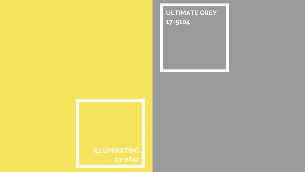
As a little break from tradition, they have actually selected two colours for 2021: ‘Ultimate Grey’, and a beautiful, uplifting yellow called ‘Illuminating’. This is a colour marriage made in heaven! Grey is a lovely, versatile neutral, and the sunshine-yellow is optimistic and cheerful. It’s been a popular combination for some time now, reflected in many home interior design trends, and it doesn’t look like it’s going away anytime soon!
Should you follow the latest colour trends?
Current trends are all well and good, but they can be just that, trends, and we all know how short-lived a trend can be. Just look at Fidget Spinners! Yes, it’s great to stay modern and fresh, but it’s much more important to understand the basics of colour theory, and the impact that colour can have on your brand and marketing efforts.
Understanding colour
In a sea of content marketing, colour can help yours to pop! So, we thought it would be interesting to explore the psychology of colour and those subconscious feelings it provokes. We’ve also included some examples of successful logos to show you what we mean!
Red (think Netflix, Coca-Cola and Nestlé) – excitement, love, strength and power.
Orange (Nickelodeon and Penguin books) – confidence, bravery, success and sociability.
Yellow (Ikea, McDonald’s and Subway) – happiness, creativity, warmth and cheer.
Purple (Cadbury, Hallmark and Zoopla) – royalty, spirituality, ambition and luxury.
Pink (Barbie, Hello Kitty and Roxy) – sentimentality, romance, femininity and youth.
Green (John Deere, Starbucks and BP) – nature, sustainability, growth and wealth.
Blue (Barclays, PayPal, Facebook and Ford) – competence, trust, loyalty and peace.
Grey (Apple, Swarovski and Britax) – stability, security, authority and maturity.
Black (Nike, Sony and Chanel) – sophistication, security, formality and drama.
By using the correct colours to reflect your services, products or personality, you can convey so much without even putting pen to paper!
Incorporating colour into your business – Base, Accent and Neutral
Do you want your customers to be happy, informed and secure? Is your brand serious, youthful and creative? How you wish to be perceived by your target audience can really help narrow down your choice of colour scheme.
Research your competition or similar products in your field as this can help you find opportunities to stand out from the crowd, by incorporating additional colours that reflect your product or service’s unique selling point.
Your base colour should reflect the most important trait of your brand and appeal to your target audience. You should then choose the remaining colours to compliment it. You’ll use your accent colour most after your base, so it’s vital that it pairs visually and also appeals to your key demographic. Your neutral should be chosen not to grab attention, but to work as a background colour. Neutrals are typically shades of grey and off-whites. You could also use black, but be mindful that it can dominate the colour scheme that it’s a part of!
There are so many things that you can do with the colour of the year with your digital marketing, if you’d like to have a think about some new fun ideas then why not have a creative mind map session with our graphic design team – you can reach out to them using hello@avidmode.com
If you enjoyed reading this blog post, check out similar ones in the sidebar. Feel free to get in touch with to chat about your latest project ideas - we love a good excuse for more tea.
