A beginner’s guide to making images web-ready
This is a step-by-step guide for beginners on choosing the right image and cropping and resizing it to be used on the web. It requires that you own Photoshop and have…

This is a step-by-step guide for beginners on choosing the right image and cropping and resizing it to be used on the web. It requires that you own Photoshop and have some basic understanding of how it works. Usually, this is where I’d waffle on a bit more about cursory topics and say something funny, but this time, let’s just get right to it. We’ve a lot to go through.
1. Context
When an image is to be used on the web, it is not enough for it to look nice on its own. It’s also subject to the constraints placed upon it by how it will appear on the website. It doesn’t make any difference how good-looking it is if it just doesn’t work in the given context.
Size
The most basic requirement is that the image is as big as it needs to be. For instance, if the image when displayed on the web will be 1000×1000, the source image must be at least that big. You can upscale an image a little bit without losing quality, 10% at the most, but no more than that. It will look blurry and people will notice. If your source image is too small, it is too small, and you will need to use a different one.
Professional web photographers take pictures that are several times larger than they need to be. This is the ideal, as it offers the most flexibility when it’s time to crop the image.
Proportions
An image’s proportions, or aspect ratio, refers to how its width compares to its height. For instance, an image with the proportions 2:1 is twice as wide as it is tall. This says nothing about the actual size of the image, but it is crucial to what we’re talking about.
If your source image has the wrong proportions, you may not be able to use it. This is one of the reasons why a professional will always use very large source material, as mentioned above, because then you’re less bound by the proportions of the final image. You can ‘create’ an image of different proportions by cropping a larger one.
Composition
An image’s composition refers to how its content is distributed. This is commonly expressed in terms of where its points of interest (POI) are. For instance, if you’ve got a picture of a tree in an empty field, the only POI is the tree. Should there be a sunset behind the tree, the horizon is another POI, and sun would be another one, provided it’s visible.
The best rule of thumb here is the so-called rule of thirds. Wikipedia has a great and very educational article on the topic which I would advise you to read. Note that this rule does not apply to informational images, like those on an e-commerce website. If the purpose of the image is to portray the way something looks, as much of it as possible should be present in the frame. More often than not, this means having the object in the centre.
Text overlay
Whether an image will have text displayed above it is a game-changer. Take the banners we use here on the Avidmode blog as an example. The fact that the article title hovers above the lower third of the image has a major impact on how we make them, and it’s not something we can ignore or pay less attention to.
Below is text of two weights and colours placed on various parts of three images.
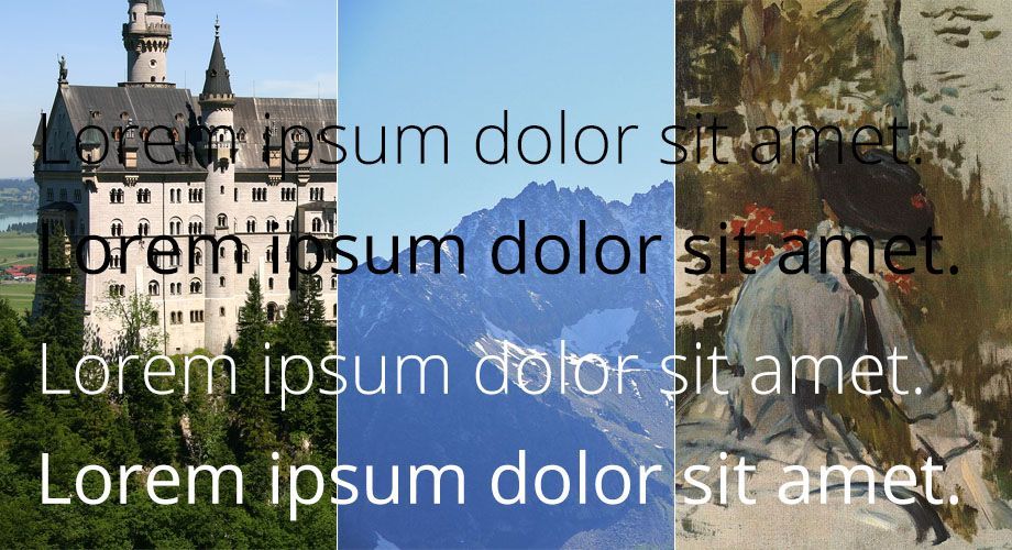
From left to right: Castle Neuschwanstein, Aiguille du Chardonnet and Jeune Fille dans le Jardin de Bellevue.
1) Right away, we can see that the rich green forest below the castle makes for perfectly legible text but the castle itself has so many details with strong contrast that the text disappears.
2) This image is the best of the three. It has a very even colour distribution with relatively low contrast. Both black and white text shows up nicely and it’s only the thin white ‘dolor’ that’s made slightly less legible by the patches of snow.
3) The painting’s canvas means white text works quite well above it, since the brightest areas are far from white. The overall brightness of the image prevents the black text from showing up much at all due to lack of contrast between it and the background.
In the above example, sometimes the text works and sometimes it doesn’t. With experience, you’ll be able to tell right away what kind of text, if any, will be legible above an image. Sometimes there are ways to edit an image in order to make it work, but in all likelihood, if you need to do that, what you actually need is to choose a different picture.
I’m reminded of the best advice I’ve ever heard from an audio engineer; if it sounds like it needs editing, it actually needs re-recording.
Recommendations
Contrast is the effective difference between two or more colours. It is made up of differences in hue and tone.
- Images that have even colour distributions and simple shapes are best. Lots of contrast in the image and complex imagery make for illegible text.
- For small text, you need more contrast between the words and the background. Small text above complex imagery is almost impossible to read and often hard to even see.
- Text weight (i.e. thickness) affects how much contrast you need. Thin text needs more to stand out whereas thicker text can be legible with only a little contrast.
- The location of the text above the image is important. The image’s interest points should not be where the text is, rather it’s better to have relatively empty space or something uninteresting below it. (Note how the banner image of this post is practically empty where the text is.)
The best thing you can do here is to experiment. Throw the source image in Photoshop and put your text above it. It doesn’t have to be exactly the same as on the website; something roughly similar will do fine.
No matter what you do, remember that the text is king; if it’s not legible, you have to change the image. It doesn’t matter how much you like the it. It has to go. Using it anyway will give a poor result and it will look distinctly unprofessional.
2. Cropping and resizing the image
So, you’ve got your source image and now it’s time to make it web-ready. To do this, we’re going to use Photoshop. The first step is to make it the right size. As with every task, Photoshop offers you many different ways of accomplishing it. Since this is a beginner’s guide, I’m going to choose the most visually informative tool, and I’ll go through an example along the way.
If you’re on a Mac, replace Ctrl with Cmd in the commands below.
The source image
Say I’m writing a series of articles about birds. For my next one, I’m covering the Cyanocitta cristata, or blue jay. Every post has a banner of the size 1000×350. This means I need a source image at least that big. Ideally, it should be even larger.
Luckily, Wikimedia has me covered. It’s got a beautiful picture of the bird, and it’s very big. It’s also under a licence which permits me to use it provided I include attribution. (Always respect the copyright holder. If you like what someone’s made, it’s only decent of you to credit them.)
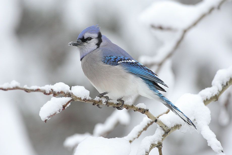
Cyanocitta cristata by Mdf
For my banner, there’s going to be text above the lower left corner. I have to make sure that there’s dead space in that area. Since the bird is only in the centre and the rest of the picture is mostly unfocused snow, I’m good on this point.
Everything looks good, so I’m going to download the image and open it up in Photoshop. The first thing I want to do is confirm that it’s big enough. To do this, we open (but not use) the Image Size tool. Either press Alt + Ctrl + i or select Image > Image Size... in the application menu.

Here, we can see that my image is 3072×2048, which is great. If at all possible, you always want an image that’s much larger than what you need. Now we’re ready to do the resize and crop.
Cropping
Resizing and cropping are two different things. The former scales the entire image and the latter cuts it into a smaller piece.
For this, we’re going to use the Crop Tool. Press C to bring it up. Alternatively, click this symbol in the toolbar: ![]() . With the crop tool active, even before you’ve done anything, you’ll note a dashed border has appeared around your image, along with a number of middle points. You may also see lines splitting the image into nine parts. This is called the crop box.
. With the crop tool active, even before you’ve done anything, you’ll note a dashed border has appeared around your image, along with a number of middle points. You may also see lines splitting the image into nine parts. This is called the crop box.
Before you do anything, you’ll want to reset the tool. In the tool menu, below the application menu, there are three buttons on the right end, the left-most of which looks like this: ![]() . Click it and it will reset the tool settings back to defaults. This is good practice to do when starting a new project.
. Click it and it will reset the tool settings back to defaults. This is good practice to do when starting a new project.
Now, since my final size of 1000×350 is clearly not the same proportions as the source size of 3072×2048 (10:3.5 compared to 3:2), I will need to both resize and crop my image. (You don’t need to calculate the proportions yourself; Photoshop will do it for you.)
At the far left of the tool menu is a select box with two text fields next to it. If you reset the tool as suggested, the select box will say Unconstrained. If it doesn’t, select it in the list. It’s at the very top. Next, type the final image size into the text fields; width in the first and height in the second. For me, it looks like this.
![]()
As you type, you’ll note that the crop box changes its size and proportions. This is as intended. If the final proportions are not the same as the source proportions, certain parts of the image will be darkened, either above and below or on the sides, depending on whether the final proportions are wider or thinner.
For me, they’re much thinner, so the crop box has changed into a letterbox shape.
The next step is to choose which area of the source image to use for the final product. We do this by moving and resizing the crop box.
Moving is done by clicking and dragging inside the box. This will change the centre out from which the image will be cropped. If that sounds complicated, just move the crop box around a bit and you’ll see how it works. Note that you can drag it outside the range of the source image but the crop box’s edges will snap to the edges of the image.
Resizing is done by grabbing a corner or an edge of the crop box and pulling in or out. This is also self-explanatory.
As you do either of these things, Photoshop will keep the proportions you gave it. Make sure that you do not resize it to be smaller than your final size. The current size of the crop box will appear when you’re resizing it. You can also see the size in the centre-right of the Info box (Window > Info). Note that the size you crop the image to here does not have to be the final size.
For me, I’m going to place the bird in the right half of the image, leaving me with dead space for the left half (where the text will be).

Once you’re done, hit Enter.
Resizing
We’re almost done now. All we have to do is make our image the final size. We’ve already given it the right proportions. Pop up the Image Size tool again, Alt + Ctrl + i or Image > Image Size....
Now punch in your final size. Make sure that Constrain Proportions is checked and that Resample Image is set to Bicubic Automatic. Then click OK. The image is now the exact size we need it to be.
3. Saving the image to a file
Final step now. It’s time to save our image. Doing so has some considerations in and of itself; one cannot simply choose the same output format for every image. Depending on the content, we want to use one of two file types. (Don’t use GIF. In all likelihood, it’s useless for what you’re doing.)
JPEG
If the image is a photograph or any image containing complicated content, this is always the format you want to choose. If in doubt, go JPEG.
Go File > Save for Web. In the upper right, below the Preset box, choose JPEG in the drop-down. Check Progressive* and set the Quality to 80. You’ll also want to check Convert to sRGB. Now you’re ready to save the image.
* A progressive JPEG is downloaded in multiple portions. This is currently the best option as it’s been shown to reduce page loading delays.
PNG
If the image is more akin to a graphic than a photograph, PNG is the first format to consider. PNG is also lossless whereas JPEG is compressed (i.e. lossy); images saved in PNG do not lose any quality. This, however, also means that they are potentially much larger.
When your image contains computer-generated text or abstract shapes, like that of an infographic, PNG is the way to go.
Saving an image as a PNG is more complicated but Photoshop comes with a preset that you can trust. In the Save for Web dialogue, choose PNG-8 in the drop-down. Check Transparency if you need it, and if the colours look off in the preview, increase the amount to 256. Note that this will make the file larger.
There are ways to tweak the settings here to shave off as many kilobytes as possible without losing quality but that is beyond the scope of this article. Just know that unless you’re working in an enterprise context, a few kilobytes here and there isn’t important.
In closing
Two thousand words on this topic may seem much, but only because the amount of skill, knowledge and effort it takes to do web imagery right is heavily underestimated. It’s not nearly as easy as it might seem, and you can’t be good at it without experience. Training your eyes to see what works and what doesn’t is half the challenge.
All the best.
If you enjoyed reading this blog post, check out similar ones in the sidebar. Feel free to get in touch with to chat about your latest project ideas - we love a good excuse for more tea.