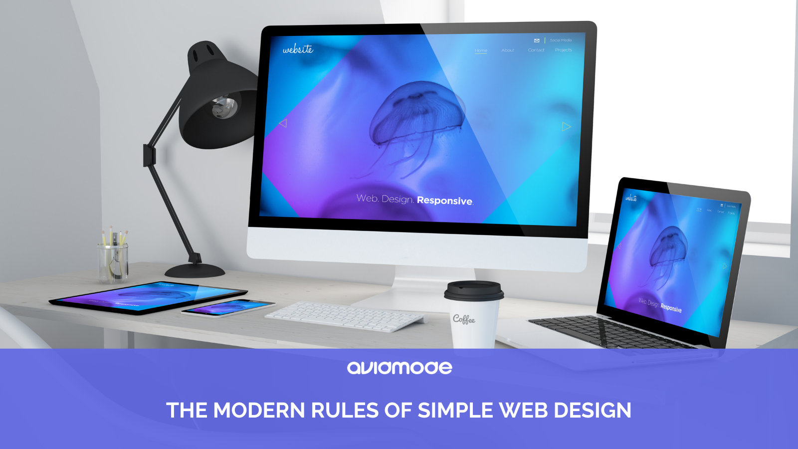
The modern rules of simple web design
In this day and age of perpetual connectivity, it goes without saying that every company should have a website. But the type of website you have can have a larger…

In this day and age of perpetual connectivity, it goes without saying that every company should have a website. But the type of website you have can have a larger impact on its success than you might realise. Any website can be seen as better than no website, but the last thing you want to do is put off your potential customers with a horrifying user-journey that no one without a degree in coding could navigate!
So how do you make sure yours is fit for purpose? Have you ever heard of the acronym KISS? It’s short for Keep It Simple, Stupid. It’s a much-overlooked piece of advice in the web design world, but it’s one that we at avidmode.com follow because it really, really works.
All too often, we see websites that are crowded and cluttered, with no way for the customer to fathom what on earth you do or are selling, let alone glean the information they are seeking. Whilst you might think a straightforward website is boring, quite the opposite can be true. Users tend not to want excitement as the site’s primary function! Instead, they would usually rather be able to use it, and get the information and experience that they’re looking for.
So, when it comes to designing your website, a few questions need raising such as:
- What is the website for?
Obviously, it’s to promote your business, but what is the key purpose? Do you want to sell your products through it? Do you want to showcase your services and what you can do for clients, as a sort of online brochure? Either way, you’ll need to ensure the site does what you need it to do.
- What do you want the customer to do?
What is the call-to-action? Transact online? Book a call? Send an email? Download more information to digest? Whatever it is, it needs to be obvious and easy for the user to do.
- How do you feel when you visit a ‘busy’ website?
Think about it, if you land on a site wanting information, how quickly do you leave it if the site is overly busy, complicated and confusing? You don’t need ALL the information on a single page, do you? If you want a little more, you can dig deeper. Think about how you browse online and put yourself in the shoes of the customer.
Simple vs busy
Some of the world’s biggest brands don’t have it right yet, so if your website is a little busy, you’re in good company! But other brands have it absolutely nailed in terms of user experience. Take, for example, Apple and Amazon. Everyone has heard of these giants, and with good reason – they both provide excellent products and service. With regards to Apple, they have highly covetable items, intuitive and with cutting-edge technology and design, not to mention amazing customer service. When it comes to Amazon, the sheer volume of items on offer is one of the key draws, as is their delivery service.
But see how different their websites look on a page buying similar, tablet-based products:
Apple iPad

Kindle Fire
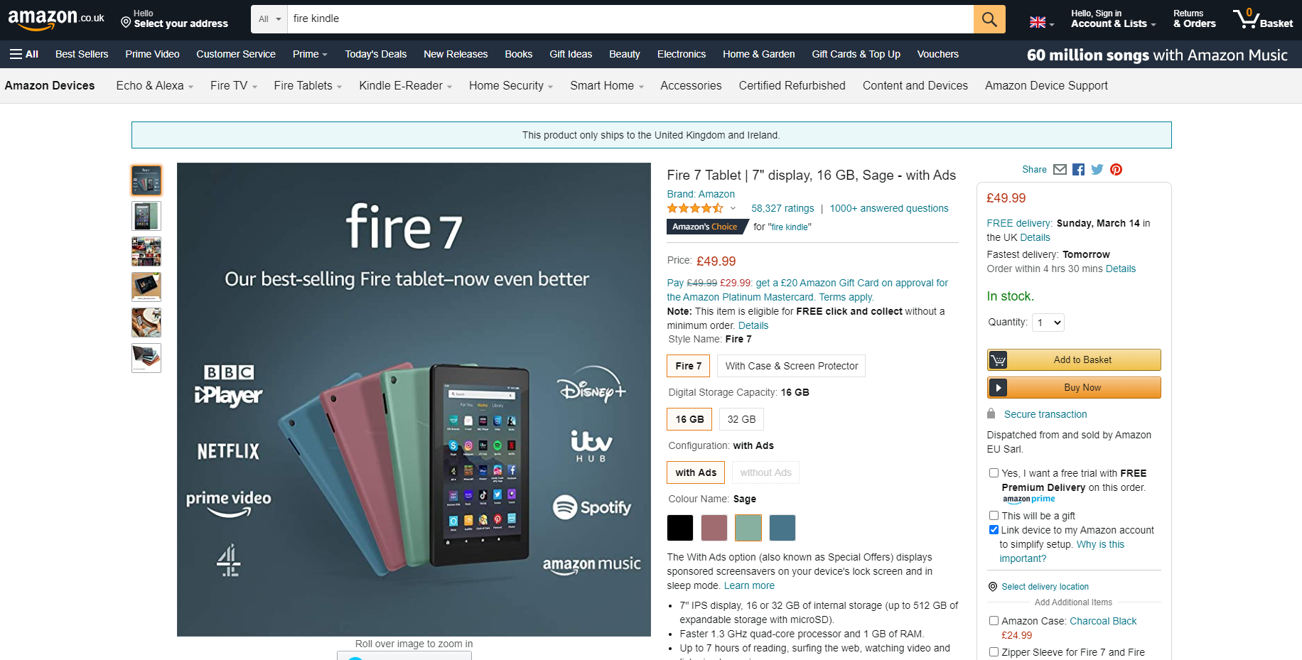
The differences are stark, although that’s not to say that you wouldn’t use the Amazon site, of course. In fact, it’s super-easy to purchase something on Amazon, especially if you have a Prime account on a mobile device. But is part of this reason because you’ve used Amazon before? Because you know what you’re buying? Or it’s a small purchase and, therefore, don’t need too much info? The fact is, the Amazon page is busy and not overly easy to navigate, whereas Apple’s page is clean and very easy to read. It takes you through the selection and purchase process with ease, which is exactly what most customers want.
Benefits of a simple website
There are plenty of benefits to having a clean website, including:
- A more straightforward navigation due to a lack of excessive information. It can be there so the customer can read more if they desire, but there’s no need to show it all upfront
- Simple sites convert better, which is why companies have websites in the first place!
- A simple design will load faster. One of the key factors in ‘bounce rates’ is the length of time a page takes to load (the bounce rate is where customers arrive on a web page and leave without spending much time on it or visiting any others). Simple designs are also better for mobile browsing/data usage
- More mobile-friendly. Most of us browse on mobile devices at some point, so it’s far better to have a site that looks good and is easy to use on them
- Content is easier to scan, which is how most people read online now
- Simple code can be fixed more easily when there are bugs
- A simple website will take up less server space
There really are plenty of benefits to a simple website, so if you’re in the market for a new site or a redesign, contact us at avidmode.com, and we will be happy to help!
If you enjoyed reading this blog post, check out similar ones in the sidebar. Feel free to get in touch with to chat about your latest project ideas - we love a good excuse for more tea.