Two (failed) attempts at being different
Good marketing doesn’t sound like marketing. It allows the reader to make impressions rather than giving them out prepackaged. It also doesn’t boast or speak ill of other companies. One…
Good marketing doesn’t sound like marketing. It allows the reader to make impressions rather than giving them out prepackaged. It also doesn’t boast or speak ill of other companies.
One of the most prevalent phrases used by design agencies in their marketing material is, ‘a different kind of digital agency.’ Its absence in Avidmode’s case is already an indicator of how we feel about it, but two recent website updates by famous companies have me wanting to elaborate further.
The being ‘different’ trend
You may or may not have seen it. It’s an approach focused around phrases that emphasise the word (or concept) ‘different,’ such as being different, doing things differently and having a different perspective. The implication is that the world has moved on from the old organisations of the 20th century which specialised in 20th century media; print, advertising and broadcasting. Now, the primary media is the Internet, in the full sense of the word (not just desktop PCs browsing websites with a mouse and keyboard).
Whilst this is all well and good, not to mention true, it’s also not a selling point. Companies offering web design services, for instance, can’t (or at least shouldn’t) market themselves by using HTML5 as a selling point. It should be taken for granted. It’s not a cool offering, it’s a basic requirement for making a modern website. One could argue the same thing about responsive design.
For the same reason, all modern companies should approach projects from a 21st century perspective. Proudly advertising that you do so gives the impression that you think it’s something special, even though it isn’t. If anything, that might make prospective clients think you’re behind the times. A big part of keeping up with the world is knowing when something has gone from ‘new’ to ‘current.’
Happy Cog; going from ‘different’ to arrogant
Another aspect of the trend is, well, arrogance. It’s not just ‘different,’ it’s ‘better.’ Although it’s not explicitly stated as such, there is too much of an implication.

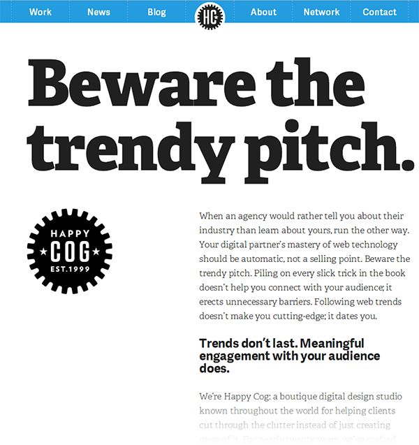
The top of Happy Cog’s front page, taken 8/6/2014
This is Happy Cog’s website today. The most recent change was new to me. ‘Beware the trendy pitch,’ it says in giant letters. Their old branding header has been removed and they’re no longer leading with a case study.
The first paragraph reads as follows.
When an agency would rather tell you about their industry than learn about yours, run the other way. Your digital partner’s mastery of web technology should be automatic, not a selling point. Beware the trendy pitch. Piling on every slick trick in the book doesn’t help you connect with your audience; it erects unnecessary barriers. Following web trends doesn’t make you cutting-edge; it dates you.
It goes on to talk about how Happy Cog is different.
We’re Happy Cog: a boutique digital design studio known throughout the world for helping clients cut through the clutter instead of just creating more of it.
And all it has accomplished.
We’re the studio that pioneered accessible, semantic markup to make your content easy for search engines to find, and keep it readily available to everyone, regardless of disability, browser or device. We taught the industry to design with open web standards instead of proprietary technologies and temporary hacks.
More than anything, this confuses me. This is Happy Cog. I used to be inspired by their work and use it as a marker for truly great web design. I mean, they were Happy Cog, all the things that they talk about in the quoted bits above.
But now? Rather than letting their work speak for itself, they’ve elected to blow their own trumpet and ostensibly demean their competition. The self-congratulatory boasting is something akin to what a group of frat boys would do, and that is not the mark of a good agency.
You don’t have to do any of that. People know. It’s in the work, in the reputation. If you need to put yourself up on a pedestal, odds are, you don’t belong up there.
Code & Theory; being too different altogether
Another company with an albeit less recent website update is Code & Theory. They used to lead with case studies. In fact, they had little on their front page other than case studies and links. I liked that approach. It was understated and rather suave.
Their new front page looks like this.

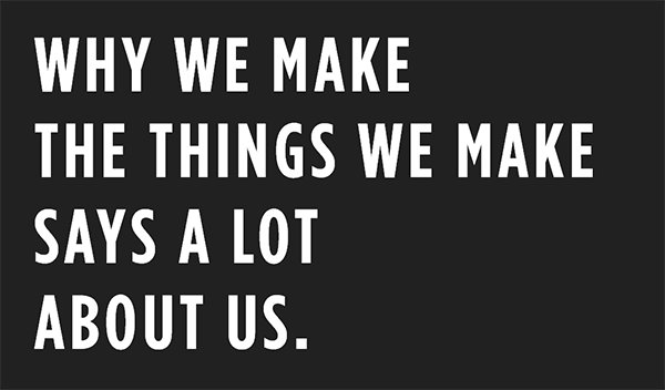
Code and Theory’s front page, taken 8/6/2014
No masthead, no navigation, not even a name of the company. If you have a mouse, your first instinct will be to hover over the text to see what happens, in which case you’ll discover that each line is a link.
If you’re on a tablet (or other handheld device), however, you won’t have a mouse, so the text that appears below each line on hovering won’t appear. You’ll also discover that the first link is broken. And after that, you’ll discover that hitting the back button breaks the website.
The technical issues aside (which are by no means insignificant), I can’t help but think that this is bordering on bad design.
Form over function
All front pages should have three things; a clear identifier of the organisation, a concise description of what kind of organisation it is and an obvious, easy-to-use navigation.
This front page doesn’t have any of those. Someone quite savvy will be able to figure them out on their own. A casual user, however? It’s not unthinkable that some people come to this website only to leave right away because they didn’t understand how it works.
If you do stick around and click the ‘Why we make’-line, you’ll be greeted with a vertical slideshow of animations talking about the company. The first line reads, ‘This is Code and Theory.’

Slide 11, ‘so we work across the entire ecosystem
It goes on to talk about how they see product and brand as two sides of the same coin, rather than separate like ‘many’ others. In other words, they’re different, and they do things in a better way, unlike these other unsung companies. I don’t like this approach of advertising yourself by implying negative things about your competition. It’s too much like the classic TV advertisement for a super-absorbent kitchen cloth that works much better than the unknown, generic version they put against it.
Keep scrolling and you’ll be shown around twenty slides. They mention stuff that in all honesty shouldn’t need to be said and some flowery words about ecosystems and storytelling, which don’t add up to much. I’m a very flowery writer myself, but I always try to write content that is both pleasing to read and ultimately useful on an intellectual level.
This slide won’t glean you much about their company. It’s even very light about their services. I would even go as far as to claim that it doesn’t adequately answer the question posed, ‘why we make?’. Near as I can tell, most of what you’ll learn is how cool Code & Theory consider themselves to be.
Humility and understatement
I’m very fond of showing instead of telling. The quality of a work will always strike truer than the words accompanying it. It’s not hard to talk pretty about something you’ve made, or to make claims regarding its character, and I find that doing so doesn’t impress anyone.
Similarly, other companies can speak for themselves. Clients shouldn’t choose you because of the negative traits of other companies, but because of your positive ones. You don’t need to push down others in order to market yourself. Doing so is easily interpreted as dodgy and arrogant. There’s enough negativity on the internet as it is.
At time of writing, I’m working on the new Avidmode website. We’re designing it based on simplicity, and its purpose is to deliver our content in an elegant way, content which is written to make readers understand who we are and what we do without telling them that they should think about us.
We’re still a new company but we’ve made a lot more success than we dared to expect. Along the way, we’ve surprised ourselves by how rewarding our approach has been. The good things these companies talk about, we’ve managed to achieve by just working with people our way. How you do things matter just as much as the result.
I’ll still follow the work of Happy Cog and Code & Theory, and I don’t think they had any bad intentions with their respective approaches to content. That said, if it doesn’t feel right with me, someone else could well feel the same, and that someone else is always a potential lost client.
Edit, 9/12/2014: Happy Cog has changed their front page since this article was written. It still talks down a bit about other ‘Agencies that merely cooperate’ but its approach is friendlier. Code & Theory’s website has remained the same.
If you enjoyed reading this blog post, check out similar ones in the sidebar. Feel free to get in touch with to chat about your latest project ideas - we love a good excuse for more tea.
