The critical parts of homepages
What elements have to be included in the homepage? This can vary from designer to designer, in this post we’ll go through the critical components of a homepage from our…
What elements have to be included in the homepage?
This can vary from designer to designer, in this post we’ll go through the critical components of a homepage from our perspective. The goal with the homepage is twofold;
– First, you want to make sure that it’s welcoming to the reader, it’s one of the first touch points that your customers will come across. It must be easy to use, have speedy loading times and be aesthetically pleasing.
– Secondly, the home page should act like a conversation. A customer has put in the effort to look for you on the web, now is your opportunity to relate to them and show them the next steps.
Because of these goals we have specific components that make up the building blog of the website.
Let’s go through some of these in our Animal Care mock website!
Example of a homepage
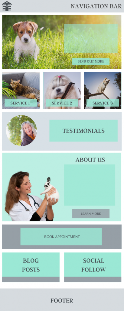
This is a long form mock up of what a website for a fictional animal care business might look like. The business looks after domesticated animals in people’s homes, it has links to top quality boarding kennels, grooming services and connections to a local vet service.
What does the client (business owner) want?
The client in this case wants to become “the premier pet care business in and around their local area, known for having in-depth knowledge of animal care”. They have great connections in the animal care industry that they’ve collated to create an overall business that suits the needs of local pet owners.
What does the customer want?
The customer wants a place where they can sort out all kinds of problems relating to their pets. Most importantly, they want to know that their family members are in the hands of professionals who care about their well being.
What components make up the mock up homepage?
Navigation Bar
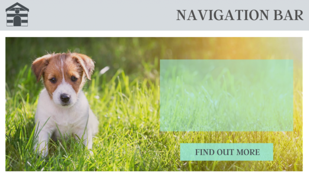
The Navigation bar is essentially your contents listing. It should show your customers all of the pages that they can visit on your site and it should be set up in a way that makes sense for a reader. You want to neatly collect pages together that make sense, for example; Dog Grooming – Vets Services – Boarding – Home Care should fall under a simple services category. The Nav bar will usually feature your logo/brand name as well.
Top tip: You can also opt in to add contact information at the top of the page, if you want it to be immediately visible – this is a good idea!
Header Content Area & CTA
This is the section that will immediately draw the eye, in this case it’s a cute puppy sat on some grass so it will 100% be grabbing the attention of the readers!
In the header content you want to show off a service offering that’s a cornerstone of your business. In this example we might use something like a find locations CTA button or a deal on holiday boarding during the summer months.
Top tip: In this area you should specify your local area and any important keywords for the website.
Services
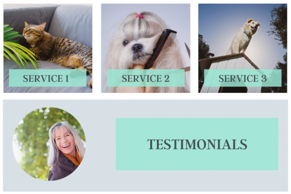
In our animal care example, we’ve chosen to feature three of the top services offered by the business. When building the homepage you need to put the main services that you offer front and center so that your readers can find what they are looking for almost instantly.
When a customer Google’s the example business they’ve most likely used terms such as “dog boarding local” “grooming in local area” “cat-sitter local area”. If you know what people come to you for, use your customers wording and place them high up on your home page as services!
Top Tip: The amount of services that you showcase on the page varies from business to business but generally, the smaller number the better.
Testimonials
We’ve made it to the testimonial section. The placing of this can be moved around somewhat, in this case we decided to hook it in under the services section as an automatic trust signaler. Testimonials and reviews are THE best way to make your readers feel more comfortable.
Top tip: Keep this updated with new testimonials as you grow, you can even add a scrolling module to allow for more than one.

About Us
Another of the trust building components is up next – the about us section on this page should link the customer through to a page that explains the why behind your business. You can add a little text here to give the reader a flavor of what your business is about and why you’ve started it up.
Top tip: If you are running a solo business it’s a good idea to get a professional/candid photo taken for this section!
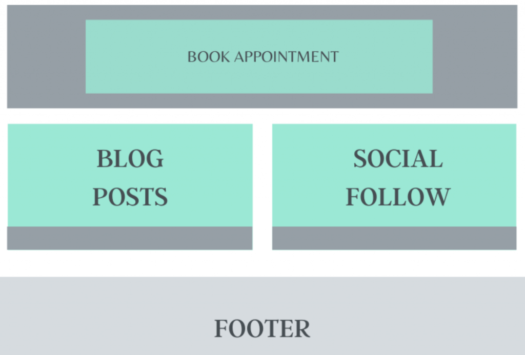
Book Appointment
This is a general call to action button, by the time the reader has scrolled this far down the page they might want an easy access way to make a purchase or call for a chat. In this case it’s set to “Book Appointment” but you could switch this up however you want.
Top Tip: Your calls to actions don’t always have to be short. Something that works just as well is a small paragraph with the next steps that the reader should take.
Blog Post/Social Follow
These sections have been split apart, on the left we’d recommend a block for the most recent blog post you’ve uploaded (only if you regularly update, it’s not a good look to have a winter based post here in the middle of summer!). On the right we included a section that pulls through from a social media platform that has great engagement. With many animal care businesses in the UK this tends to be Facebook!Top Tip: Always keep your social media links to the bottom of the page. You want to keep people on your website for as long as possible rather than sending them off somewhere else.
Footer
The final part of the homepage!
The footer should have contact information, your terms and conditions/privacy declaration links, social links and sometimes a navigation list that could take the reader to other parts of the website.
Top tip: Try to keep this section clear of clutter. Often this section can get a little overburdened with content and links. Only place the really important links here!
The End
Congratulations for making it through to the end of the homepage run through.
We hope this has helped to make it clearer why designers making certain decisions for your website.
As always, if you’d like to look into creating your own home page, we’d be happy to sit and have a chat with you about it over a cup of tea!
Send us a quick email to hello@avidmode.com and we’ll set up a meeting.
If you enjoyed reading this blog post, check out similar ones in the sidebar. Feel free to get in touch with to chat about your latest project ideas - we love a good excuse for more tea.
