Make the most of WordPress Gutenberg for Blogging
Getting the most out of your content We’re almost constantly banging on about blogging at Avidmode. There are just so many benefits to doing it, whether you are trying to…

Getting the most out of your content
We’re almost constantly banging on about blogging at Avidmode. There are just so many benefits to doing it, whether you are trying to show off your expertise in a subject, building a catalog of helpful guides to add extra value for your customers or simply trying to find more leads. Most likely it’s all of the above.
We thought it might be helpful to go through some of the ways that you can make your blog posts look much more presentable with WordPress Gutenberg.

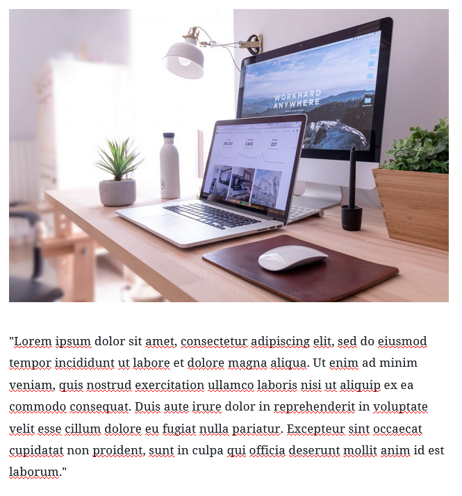
Gutenberg is the WordPress editor that you use on the back end of your website or blog to create pages and posts. It’s what we call a “block editor” – meaning that each of the sections of the post is treated as a block. For example, an image with a paragraph of text would consist of two blocks, example to the left. ⬅️
The bulk of the blogging work is in the writing, but the person reading will want to see a blog layout that is;
- Easy to read, non cluttered content works best. It also needs to be simple to navigate through, especially if it’s a long form post.
- Aesthetically pleasing – the more interesting the post looks the more likely the reader is to stick around. Think about the way you get caught out buying something from the shop because it has pretty packaging, blogging works the same way.
Gutenberg makes it really easy to format your posts to do both of these things. Let’s dig into some of the settings that you could use to boost the look of your posts.
Content blocks
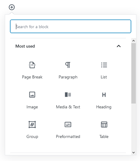
WordPress has been clever and made it easy for you to find the most used content blocks at the click of the button. You can hover over the webpage to find the little circled plus mark or use the same icon in the top left hand corner of your screen. This will flash up options that look like this one down below.

I’ll break these down for you now so you know the best times to use them.
The Avidmode “Most Used” Content Blocks
- Page Break – This uses the block as a white space provider or a page break.
- Paragraph – The bulk of your content should be in paragraph format. Remember that if you put too many sentences together as a paragraph it becomes much harder to read.
- List – Just like this one we are using now, you can have bullets, numbers and you can indent and outdent to your hearts content.
- Image – Images really help to break up a post, if you don’t have too much time to fiddle around with creating images for your posts, try and find one that fits the theme of your post, size it and pop it at the top of the page.
- Media & Text – Taking things to the next level by combining both text and image. We have an example above in this post.
- Heading – Perhaps the most important on this list, headings allow you to break the content into different sections. Your top heading should always be H2 and the ones underneath can be H3 and H4’s.
- Group – This block allows you to connect more than one group of content together, this means that you can move it around the screen and they will act as if they are attached.
- Preformatted – You probably won’t need this one as much as the others, it allows you to type out any content without any attached styling and it will keep all the line-breaks that you create intact.
- Table – Another really useful way of presenting text or data. A table really assists in making the layout of your post more pleasing to the eye.
Other Gutenberg Options
These are just some of the options that you can use in the Gutenberg editor. There are other blocks that you can use including buttons, calendars and embedded links – to find these, go and search the block options by scrolling down and clicking into the widgets or other drop downs.
If you make an error in choosing the block type you can always the button in the top corner of the block to switch it. We often write things out as paragraphs and then switch into headers, quotes or lists!
One of the other things that we should mention in this post is the ability to change text colours and backgrounds. You can see in this post that we’ve used a media/text block at the top of the page, the text is sitting on a red background and the button below this paragraph is also red.
You can adapt any text or background colours in the colour setting once you are clicked onto a block, you can find this on the right hand sidebar.
If you enjoyed reading this blog post, check out similar ones in the sidebar. Feel free to get in touch with to chat about your latest project ideas - we love a good excuse for more tea.
