What everyone must know about infographics
Create infographics about topics in your industry that are important. As people share the infographic, you’ll likely see more traffic and sales. It’s the kind of week where I’m having…
It’s the kind of week where I’m having a struggle thinking about what kind of topic to cover for the blog. I think we all feel this way from time to time, it’s only natural. One of the ways to get around this block in the brain road is to do something a little different. Take a step outside of your usual blogging zone and shake things up with an infographic.
You’ve probably noticed them everywhere on social media and if your anything like me and was in school in the last 10 years or so it’s likely that you had to make one for school. Essentially, all they are are copies of those posters that you made for a class back in the day but this time they are electronic.
An infographic works well for a few reasons.
First up, they are easily digestible content. In a recent tweet chat #BizapaloozaChat we were discussing human attention spans when it comes to sales. Turns out that most people don’t have a huge amount of time to take in heaps of information and if they do have the time they’d rather spend it elsewhere.
An infographic is short and sweet, it takes the salient pieces of information and places them all in one eye-catching format. This gives you the ability to flex some creative muscles whilst keeping your written content down to a minimum.
You are likely to be posting the infographic across your social media platforms which is perfect. Images or posts with images often do better than content that is solely written. With social media, you have to be standing out from the crowd, it’s very easy to get lost in a sea of messages so always give yourself the best opportunity to be seen.
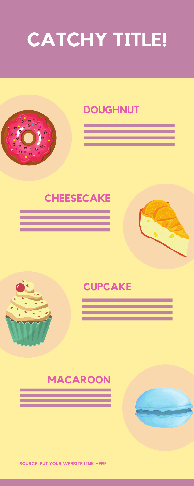
When reading infographics I think there are a few simple rules that really ought to be followed which I’ll explain with my own handy dummy infographic…
You must make sure that the written content on the infographic is done in soundbites. You don’t want to be slaving over paragraph upon paragraph only to realise that your graphic now looks like a colourful A4 page with teeny tiny text. If you are going to build an infographic based on a blog post, read through it beforehand and pick out the bug hitter points that you’ve made in the text and find a way to either break it into chunks or rip out the headlines and write based on those.
An infographic is all about the look, it might be a good idea to get someone who is graphically competent to have a look over your draft with you. Layout, imagery and spacing are all very important and if your anything like me you’ll find yourself zoomed into the graphics and be unable to get a good idea of how striking it will look to your potential viewers. Four eyes are better than two when it comes to all sorts of things and creative endeavours are really no different.
Those are two pretty simple rules but if you make sure that you have them covered your infographic is much more likely to be a hit.
So, you’ve got a bit of the theory down and now you’re ready to jump into it and get creating, but which topics are really suited to the infographic format?
There are literally tons of different topics that work well on an infographic.
Here are some ideas for a few small businesses that we’ve come up with.
General – Trends in a sector, end of the year wrap up, yearly style guides, seasonal picks, reminder infographics with important dates, top 10/50/100 of a topic, about us or history of.
Food based businesses – Recipes, seasonal foods, menu changes, making of infographic, health/healthy eating, exercise, food and kids infographics, foods to avoid, how to use different appliances, types of food (beers, fruits etc)
Shops – how to tutorial, evolution of a topic, behind the scenes, fashion tips, graphic and print examples, ethical topics, location based infographic, routine infographic, understanding techniques.
Trades – how to’s, keeping areas tidy and safe, using your new area, architecture/history behind, care for your car/home/properties, teaching the process of trades, how is a house built, ethical practices, sustainability.
Education – learn about topics, benefits of, understanding design, education in different locations, turning a hypothesis into an infographic.
As you can see there are swathes of topics that you could cover and if you have an editorial calendar already created it might be a good idea to take a look over your topics and see if any could fit into the infographic format.
If you have a creative mind then infographics might be a great way to break out from the crowd. For more information or a chat on the subject of blogging, reach out to Kittie or Gem at hello@avidmode.com
If you enjoyed reading this blog post, check out similar ones in the sidebar. Feel free to get in touch with to chat about your latest project ideas - we love a good excuse for more tea.
